

Wednesday, April 28, 2010
Magpie
Sitting in my kitchen listening to Muse and finally working on my jewelry website I've procrastinated on for about 4 years ... here's a sneek-peek of some of the art work for the site:


Tuesday, April 27, 2010
Monday, April 26, 2010
Chapped Nose
Sketchbook fun! Enjoying the first few days off from school ... but time to paint soon :)


Sunday, April 25, 2010

Type Face
Here's another oldie ... my Type Face assignment for Guy McCrum's class first year ... (I've included my reference photo ... there were over 400 photoshop layers in the final copy) ...


FREEDOM!
This is another old one from last semester for Fiona Smyth's class ... can't remember what the assignment was, just that it was some editorial thing...


Sunday, April 18, 2010
So.. because I seemed to have developed a severe case of a.d.d. while studying I'm putting these up ... I did them last summer / last spring ...

Okay so this one (above) I kind of blatantly stole from Nadia Flower ... I couldn't help myself I really wanted to try drawing in her style ... so credit to her with the composition and concept ... I did however substitute my sister in as the character present, as well as added my own critters ... some sort of weird raccoon creature I saw in Costa Rica ...


Okay so this one (above) I kind of blatantly stole from Nadia Flower ... I couldn't help myself I really wanted to try drawing in her style ... so credit to her with the composition and concept ... I did however substitute my sister in as the character present, as well as added my own critters ... some sort of weird raccoon creature I saw in Costa Rica ...

Old Stuff
Here's a bunch of old pieces - mainly from first year at OCAD (some were for fun), first semester's drawing with David Cheval ... (he's a really good prof, p.s.):


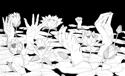
This piece (below) took FOREVER to do - this isn't even the full image ... pretty sure I logged over 40 hours doing this one (but I enjoyed it!) I love black pen work and extreme details, also love overlapping images and layers ... within this one I made sure all of the blades of grass continued correctly ... none overlapping and cutting off half the stalk ... made a mistake on one (and it still kind of bothers me lol) ...


This last photo represents most of the pieces (not all) that I did for Cheval's final project ... fortunately this was due after my exam so I had about a week to devote exclusively to this assignment ... :)
Friday, April 16, 2010
Cupcake Anatomy
heehee cupcake fixation continues ... quick sketch in moleskine during a lecture ... :D


Poem illu from last year
There was a request for these pieces to go up; this was an Anson Liaw project ... we had to illustrate this poem he gave us, creating two images:


Colour version:

I had a lot of trouble picking a colour copy / combination. I finally went with a monochromatic scheme, but here's a picture of some of the other variations I tired along the way ..


Colour version:

I had a lot of trouble picking a colour copy / combination. I finally went with a monochromatic scheme, but here's a picture of some of the other variations I tired along the way ..


Raspberry Imps

This is a work still in progress, done in my watercolour moleskine. When I'm done exams I am going to hopefully finish it ... I want to add more imps hidden between tendrils of forsythia and yellow raspberries ... I want to add some of the imps attacking one of the birds, plucking its feathers off for their own gowns ... :)
Thursday, April 15, 2010
Final Taxali Series
Okay
Here is my series for Taxali's final project
Finished at 6:00 am ... slept for a bit, up at 7:20 am for my 8:30 lecture in Modern Art History ... three hours later return to residence to eat lunch and then back to school for Gary Taxali's illustration class / critiques - 4 hours ... LONG DAY ...

These were all done on wood panels - drawn freehanded, then painted in acrylics and acrylic inks, 16x16 inches ... the found wood was an after thought - I really like how they turned out. Taxali / class said they could see these as wall paper patterns, on fabric and teacups, notebooks, cards, and art sold at Urban Outfitters ... I like good crits :)


Taking on the monster ... this sketchbook was on sale at Curry's for $19 ... I couldn't resist, there was just something about the crisp, blank pages; main attraction, however, was the size: approx. 15 x 20 inches :)

This was just some sketch I did for fun one night. Inspired off both Darger and Sachiko Kanaisumi. It was this sketchbook page that later inspired my final illustration project for Gary Taxali (not yet posted, crits were today, still being marked).

This was just some sketch I did for fun one night. Inspired off both Darger and Sachiko Kanaisumi. It was this sketchbook page that later inspired my final illustration project for Gary Taxali (not yet posted, crits were today, still being marked).
Tuesday, April 13, 2010
Reoccurring Hamster Nightmare

This was one of those projects where about an hour in you start thinking "why do I do this to myself" ... and then that little voice in the back of your head snaps back, "because you're an idiot! ... and it will look cool."
This was another Harvey Chan media studio assignment. The theme was recurring dreams; mine, an exam-stress triggered dream (of my cousin's) in which a large cage of neglected hamsters is left to starve, rot, and start eating one another. It was done in watercolour. I've also included some process photos and detail shots ...
Self-portrait Roughs


These were my final two options for my self-portrait assignment for Fiona Smyth's class last semsester. I went with the bottom one, the one with the plaid. I've included the two pen drafts because I love rough work / process work and thought some people might be interested in seeing them ...
Moleskin Page

Perfect gift for any one interested in drawing or painting ... moleskin sketchbooks (<3) my friends and I are all addicted to them ...
Did this sketch over christmas break, Henry Darger really influenced this illustration. Done in black micron pens, size 01 (favorite type of black pen!)
My hunt for the PERFECT WHITE INK :)

More moleskin pages :)
Okay, so I have been searching for the perfect white ink for the longest time ... now I can finally say I've found one I'm really happy with. Here's a kind of review: *Note: always go for acrylic inks when searching for whites ... although I prefer acrylic inks for almost all colours too! ...
Liquitex: Too watery, too translucent
FW: A bit thicker, but still I found I had to do several coats of it for the white I was looking for
Speedball: PERFECT! Small bottle - not as much ink given as the two brands above, but has a really great opacity to it
Also: if you are looking for a pen-format white ink and do not like using nibs, sharpie makes really great paint pens (THAT COME IN WHITE) ... although I recommend their poster-paint based over their oil-based paint pens ... you can find these in Gwartzman's art store on Spadina Ave
Monday, April 12, 2010
El Dia De Los Muertos

Hahaha my friends call these my drag-skeletons ...
This was another Harvey Chan piece for media studio - actually, I'm pretty sure was our first assignment. The project was to create a poster for El Dia De Los Muertos, or, Day of the Dead. We had to use black india ink only - I recommend Speedball Ink (favorite black <3) ... I loved this project ... :)
Wee Beasties

This was my first attempt in oils. I really enjoyed using them - it was so much better than using acrylics ... it was so nice to be able to come back to my palette after a couple hours and still be able to paint ... Anyway, this piece was for Harvey Chan / media studio.

For our final History of Graphic Design essay we were required to hand in a poster as well, done in the same style as our essay topic; mine, Art Nouveau, with my poster inspired off the works of Alphonse Mucha (<3). Only after I was done did I realize the spelling mistake lol ...
I created the character with a few friends in mind - pulling pieces of their appearances together to create a whole. I wanted this illustration to have the look and feel of a Mucha, but with the modern art student in mind.
Here are some process photos:


These were a few Easter cards I made for fun - I kind of based the character off Humpty-Dumpty. These were created using all acrylic-inks ... I have been trying to move away from using black (so hard-I love black ink!) because all-colour is more of a challenge and blacks have a tendency to flatten an illustration when combined with colours. P.s. the colours are much brighter in real life... they're bad here because I took this pic with my phone.
Before + After

This was done sort of recently for Gary Taxali's class. The project was called 'Before and After'. My concept was of Marie Antoinette ... it was a mixed-media project, and I used acrylics, watercolours, gouache, and acrylic inks. I'm really not a fan of the second half, the 'after' part; it's one of those "what were you thinking???" pieces - this one I did on a weekend with about 4 other studio projects and just didn't have time to redo ...........
Gouache-resist Technique

This was something I did for fun one night. It's the white rabbit, from Alice in Wonderland (off the original illustrations by John Tenniel) ... I'm kind of addicted to the Alice theme at the moment :) . The technique I used here was one taught to us by Harvey Chan, called the Gouache-resist technique; the resulting image often looks like the woodcut or a relief print.

Dark Folk Stories

This piece was done this semester for Harvey Chan's media studio class - an experiemental media (and technique) class. The subject was dark and/or twisted fairy tales; mine illustrates the consequences of stepping into a fairy-ring. This piece was created using charcoal on mylar, blended altogether with a brush (because I hate the feeling of dry medias...).

This was a piece I did earlier in the semester for Gary Taxali. We were given a list of random words, made to pick three, and then form an illustration from it. My words were 'bear', 'pink umbrella', and 'hide'. This is not the full illustration (but the best picture I could take of it with my phone - most of it is there).
ZINES 1, 2 & 3
So I just posted the first three zines I created for Fiona Smyth's class (2nd year) ... they were made to continue on, and by placing them all side-by-side they connect and the story continues. All three were created with water colours and black pen, and loaded with lots of tiny details (which I love and include often). If you are interested in buying a copy of one of the zines, let me know ... I will get back to you with size and pricing a.s.a.p. :)
Here's the process photos:

(part of initial sketchbook thumbnail sketch)

(starting to apply watercolours)


... this part, the printing process, is entirely due to my extremely generous and selfless boyfriend; he offered to come with me (and make sure nothing happened to me) on a trek through Toronto at 2:00am and through freezing rain (no umbrellas, of course) ... walking an hour to get to the only 24-hour Kinkos that prints large-scale colour images ... then helped me cut all of my printed illustrations (over 30 of them) down to size, and then walking an hour again back to res ...only arriving back at 4:00am ....... thank you <3


i made individual mylar envelopes for my large three zines (which after class my prof bought :) )
Subscribe to:
Comments (Atom)